
In our data-driven world, there is a deluge of information coming from all directions. However, the human brain is not always capable of absorbing raw data as numbers and text. Here is where data visualization becomes a hero. It is the art of turning data into a form that is easily understandable, often in the form of graphs, charts, and maps. It transforms complex data sets into visual graphics making data more accessible and easy to understand.
The Importance of Data Visualization in Analytics
-
- Easier Interpretation and Understanding: Visuals are processed multiple times faster than text. A well-made chart or graph can summarize complex data sets and enable viewers to understand the data at a glance
- Quicker Action: By turning data into a more visual format, one can identify patterns, trends and outliers more quickly. Seeing data in these visual formats can help businesses make decisions faster
- Better Retention: People remember visuals better than text. Good visualization helps users remember the information and the desired actions better
- Communication of Insights: Visualizing data provides an important bridge between technical and non-technical roles. It’s a method of communicating complex data in a simple way, making it essential for data analysts, marketing professionals and decision-makers
- Identifying Patterns and Relationships: Visualization aids in seeing patterns, correlations and trends that might go unnoticed in text-based data. For instance, scatter plots can show correlation and relationships, while line graphs can display trends over time
- Color Theory: Color is a vital component of data visualization. Effective use of color can highlight important points, guide the reader’s eye and make the visualization more appealing. However, misuse of color can confuse or mislead. Understanding basics of color theory can greatly enhance the quality of your visualizations
- Ethics in Data Visualization: Lastly, while visualizing data is powerful, it’s also a responsibility. Misrepresentation of data can lead to misinformation. Always strive for honesty and clarity in your visualizations
Effective Data Visualization Techniques
There are a multitude of ways to visualize data, each with its own strengths. Here are some commonly used methods:
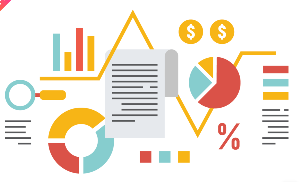
- Bar Chart: This is one of the simplest ways to visualize data. It can be used to compare different groups or to show changes over time.
- Line Graph: Line graphs are perfect for showing trends over a period of time. They are commonly used in tracking the rise and fall of stock prices, temperatures, etc.
- Pie Chart: This is a useful visualization to display proportions or percentages. It shows the relationship of parts to a whole.
- Histogram: Histograms are similar to bar charts but are used to display frequency data. They are especially useful in statistical analysis.
- Scatter Plots: Scatter plots show the relationship between two variables. They help identify correlations or trends.
- Heat Maps: Heat maps use colors to represent different values. They can show patterns and concentrations.
- Box Plots: Box plots are used to display the distribution and skewness of data and to identify outliers. They provide a good summary of one or several data sets.
Remember, the type of visualization you choose should depend on what kind of data you have and what you want to demonstrate. There is no one-size-fits-all approach to data visualization.
Data Visualization Tools
There are many tools available for data visualization. Some popular ones include Tableau, Power BI, Google Data Studio and Excel. These tools often require minimal coding knowledge and offer a wide range of possibilities for data visualization.
Conclusion
Data visualization is a powerful tool in the world of data analytics. It simplifies the complex data, communicates insights and guides decisions. When embarking on your journey, remember the goal is to make data more understandable, not more complicated. Keep your audience in mind, choose the right kind of visualization and use the tools at your disposal to effectively communicate your data.
As we delve deeper into the realm of data visualization, it’s important to know that this is just the start of our journey. In upcoming articles, we will be exploring a variety of tools and techniques that are critical to mastering data visualization. From the basics of Excel to advanced software like Tableau and Power BI, we’ll uncover the features and functionalities that make these tools so powerful for data analysis and visualization.
We will also be dissecting different visualization techniques, explaining when and how to use them for maximum impact. Whether it’s a scatter plot for demonstrating correlations or a histogram for showing data distribution, we’ve got it covered.
So, make sure to stay connected and keep checking out our future posts to broaden your understanding and enhance your skills in data visualization. As always, our goal is to make this journey as informative, practical and enjoyable as possible for you. Let’s explore the incredible world of data together!